Assignment 1
A. Impression, contents and effectiveness
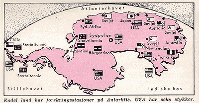
From the first impression of a map it should be clear what the map is about. 'Does it clarify the content at first glance?' The example shown below could raise the question whether this is a world map from before the Big Bang. The maps shows country names and flags quite unorganised on pink ground. The pink shape can be mistaken for a combination of continents very easily. After a closer look the flags reveal the key to another interpretation, confirmed by the text below. This map shows Antarctica and the local research centers from different nations. (Hvem, Hva, Hvor. 1971 Aftenposten, Norway). The bird's eye view used in this particular map is the cause of the misinterpretation. The horizon in the background gives the impression of watching the top of the world instead of watching the bottom.
We started off with a wrong first impression. After a second look the content, research centers in Antarctica, seems to be clear. But still this map doesn't appear to be the most effective there is. Why?
B. Clarity
Let's stay with this map. Does this map show us that the majority of research centers is American? Before drawing that conclusion it takes some counting. A table would make this comparison with other nations easier. If a designer would like to stick to a map, where small symbols, explained in a legend, could show location and nationality at the same time. Now the flags take too much space and the dots show the locations. The dot in the middle however is marked with a star, which is not explained. So what is the message to be communicated in this map exactly? It looks as if it tries to tell us the exact locations of the research centers, combined with a comparison of number of different nationalities. This means there are two messages to be communicated.
This map lacks clarity because one symbol is un explained. We just saw that the content requires two messages to be communicated. The first one is clear, but the second one is not communicated clearly enough and thus the map is not effective. Ineffectiveness impairs usability and readability!
The effectiveness of a map is hard to measure. Like illustrations in general, an effective map adds information by itself and doesn't need an additional explanation in words.
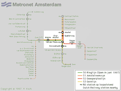
If the map is clear and logically designed, reading it should not be difficult. In the example below two areas of the Amsterdam subway map are highlighted. Try to decide which names and stations belong together. For example, it is not immidiatly clear which station is 'Van der Madeweg', nor is it clear whether the position of the Dutch Railway label is significant, nor is the meaning of the circles clear. Although this map looks well organised it does suffer from minor mistakes in clarity.
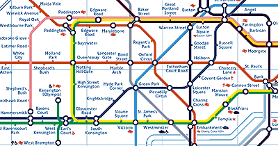
Compared to the design the map is inspired by, differences are noticeable. The subway map of London doesn't leave many questions unanswered. Because of the use of symbols extra information is given. For further information details, please take a look at this image.
This map gives answers to the questions of a lot of different kinds of users. Look at the different kind of stations. All transfer stations are pointed out with blackcircles. All end station are indicated aswell. Train stations and ferries are indicated with symbols, as well stations specially facilitated for handicaped people. The wheelchair symbol combined with an arrow is explained in the legend. So are the stations marked with a red cross. Conditions at each of these stations are explained in dedicated legends. This means a lot of information in one map. At http://www.thetube.com/content/tubemap several options are given for those travellers who don't demand such highly detailed maps. For large cities such as London this is a nice solution.
C. Map interpretation
Impression, contents, effectiveness and clarity all contribute to the ease of interpretation of the map. You can ask yourself whether there is an overkill of information or not. Social statistic maps usually attempt to answer or illustrate more complex questions than the ones above. Interpreting such a map the right way can be very difficult, especially if it is poorly designed.
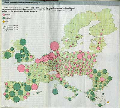
This European Union map should tell us about the livestock of its (candidate)members. If we are to believe the legend at the upper left, cows are not included. The conclusion drawn in the title is "Pigs are concentrated in North-West Europe". Each circle represents the average sum of pigs, sheep and goats of that particular area in thousands. The colour of the circle indicates which sort of animal is in the majority. In order to draw the conclusion made in the title, this map appears to do a proper job. But wouldn't it be wise to show the actual data here?
Like in our first example, a map could be preferred. Still, not all the sizes of circles are mentioned in the legend. Here we find empty circles, in three sizes, indicating that the circles on the map refer gradually to the amount of live stock. The largest circle by far is the one near Denmark. But what size is it? And do the circles in the south of Belgium matter? What colour do they have?
Another issue here is the relation between the area sizes and concentration. Several countries are divided in very small areas, where others consist of one large area and a couple of average sized ones. How does this division effect the concentration in large areas?
We will discuss numeric relations later in this series of lectures.
Practical Assignment 1.1
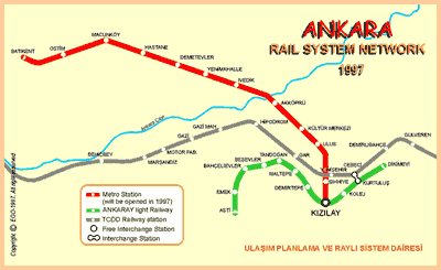
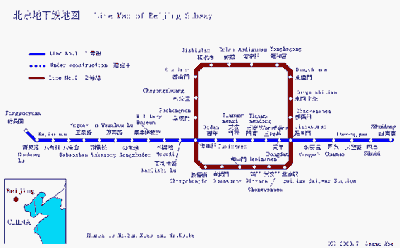
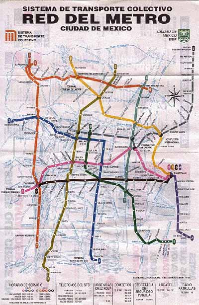
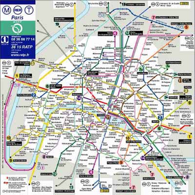
1. Analyze and compare the four maps below by using the coming aspects:
Please keep it short.
2. Describe a better way of designing a subway map and give arguments.
Ankara:
Beijing:
Mexico City:
Paris:
Practical Assignment 1.2
The following links connect to four different route planners. Again the aim is to compare them, but this time you have to keep in mind which of them provides you the best map information to travel from one part of the city to the other. You start your trip from Peizerweg to Celebesstraat in Groningen (NL). Look at how detailed you can get the map on your screen and make an analysis on the basis effectivity and clarity. Then finally draw your conclusion which one you prefer.
(Click to enlarge)
(Click to enlarge)
(Click to enlarge)
(Click to enlarge)
Due date: September 19th, 2002 with a maximum of 4 A4-sheets in .......'s mailbox.
Use http://www.reed.edu/~reyn/transport.html to find an example which comes closest to your standards.
(Click to enlarge)
(Click to enlarge)
(Click to enlarge)
(Click to enlarge)