
7. Example: Germany
In this part we use a table with differences of German dialects. [source: Forschungsinstitut
für deutsche Sprache, Marburg?] The source data is not available. The
difference table and files for drawing maps are in this zipfile:
de.zip
In this part we will make maps with the mapdiff program. With this program
you can draw a map directly from a table of differences:
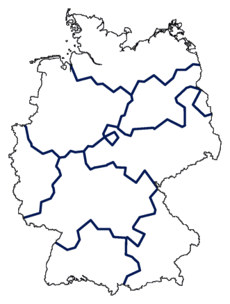
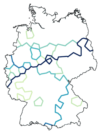
mapdiff -c 2 de.cfg de.dif > de00.ps
Below is the resulting map. The line colour is an indicator of the relative
difference between the locations on both sides of the line. A darker
line indicates a larger difference.
Such a map is not very useful. You only get to see local differences, and those
are not very meaningful. The global picture is missing.
Things change if you start with clustering.
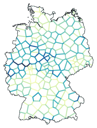
7.1 From differences to clusters to differences
If you do clustering based on differences, you get a division into groups. That
grouping says something about the differences between individual members,
this time not based on comparing them pair-wise, but based on into which group
each element was put.
You start simple. You make a clustering, and split it into a number of
groups. You use the resulting partitioning to make a new table of
differences. If two locations (items) end up in the same group, then
the differences between them is 0. Otherwise, it is 1.
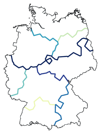
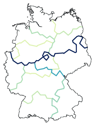
With the cluster program you can make a
clustering, and at one go convert the result into a new table of
differences. To get differences based on grouping, you use the -b option. With the -m
option, you define how many groups should be used. Here is an example
based on a division into eight groups:
    cluster -wm -b -m 8 de.dif > tmp
    mapdiff de.cfg tmp > de01.ps
With mapdiff you make a map from the new differences.
This is how it looks:
This looks like an ordinary cluster map, except that clusters are not visualised with
colours, but with lines between clusters. But if we take things one step
further, things become more interesting...
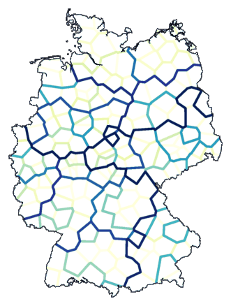
We do a clustering, and make a division into a number of groups. If two
locations end up in the same group, then we set their difference
to 0, otherwise to 1. Then we make a division into another
number of groups. If two location end up in different groups, then
their difference is increased by one.
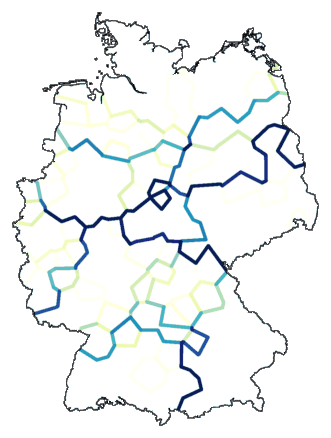
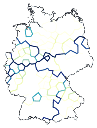
We begin with a division into two groups, then three, increasing one level at a
time, up to eight groups:
    cluster -wm -b -m 2-8 de.dif > tmp
    mapdiff -C .1 de.cfg tmp > de02.ps
The result is shown below. The darkest line indicates the primary split, the
second darkest line the next split, et cetera. You get a visualisation,
not of a
"flat" cluster division, but of a stepwise division.
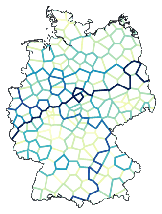
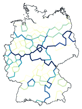
Why stop at eight groups? There are 186 locations. Let's continue splitting the
clustering up to those 186. (To get reasonable line colours, you need to
play with contrast a bit, using the options
-c and
-C of
mapdiff.)
    cluster -wm -b -m 2-186 de.dif > tmp
    mapdiff -c 6 -C .1 de.cfg tmp > de03.ps
7.2 Cophenetic maps
In clustering, groups are merged based on differences. To start with, each
element is a cluster of its own, a cluster with only one element. The two
clusters that have the smallest difference are merged into a new cluster.
Then the difference is calculated between that new cluster, and all
remaining clusters. (Exactly how that is done is what sets different
cluster methods apart.) Then again, the two clusters with the smallest
difference are merged. And so on, until all is merged into one big cluster.
The differences between clusters (subclusters, subsubclusters) are used to draw
a dendrogram:
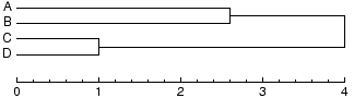
Those differences between clusters can also be used as new differences between
elements. The difference between two elements is defined by the difference of
the two clusters that were merged, joining the two elements into the same
cluster. From the dendrogram above, you can derive this new table of differences:
| | | A | B | C | D
|
| | A | 0.0 | 2.6 | 4.0 | 4.0
|
| | B | 2.6 | 0.0 | 4.0 | 4.0
|
| | C | 4.0 | 4.0 | 0.0 | 1.0
|
| | D | 4.0 | 4.0 | 1.0 | 0.0
|
The differences in this table are called the cophenetic
distances.
If you use the -c option, cluster
will create a difference table of cophenetic differences. Based on this table,
you can draw a map. An example, using the weighted
average clustering method:
    cluster -wa -c de.dif > tmp
    mapdiff -c 2 de.cfg tmp > de04.ps
It becomes clearer if we set a limit to the number of groups:
    cluster -wa -c -m 24 de.dif > tmp
    mapdiff -c 4 de.cfg tmp > de05.ps
Another example, this time using
Ward's method:
    cluster -wm -c -m 12 de.dif > tmp
    mapdiff -c .6 de.cfg tmp > de06.ps
7.3 Fuzzy clustering
Clustering, as we have used it up to this point, has one major weakness: it is
unstable. Little permutations (like noise) in the data can have large
effects, especially when in reality the cluster borders are not as clear
as an ordinary cluster map would suggest.
We can take advantage of this instability, turning a weakness into its opposite.
Before we start our clustering, we deliberately add noise to the data,
and see how this effects the clustering. We don't do this once, but
many times. And then we count how often each cluster border
emerges. If we make a map using these counts , then the darkness of a
line visualises the likeliness that it is part of an actual cluster border.
An example, clustering with Ward's method, a
partitioning into eight groups, noise level 1, repeated fifty times:
    cluster -wm -b -m 8 -N 1 -r 50 de.dif > tmp
    mapdiff de.cfg tmp > de07.ps
Another example, this time clustering with
weighted
average, and a partitioning into twelve groups:
    cluster -wa -b -m 12 -N 1 -r 50 de.dif > tmp
    mapdiff de.cfg tmp > de08.ps
The
cluster program can apply only one clustering method, using
only one table of differences as input. But you can use the
difsum
program to combine difference tables, so you can still make maps that show the
combination of different clustering methods. The following example joins
three clustering methods. (Because the first two methods are closely
related, those two combined are weighted equally to the other method alone.)
    cluster -wa -b -m 12 -N 1 -r 50 de.dif > tmp-wa
    cluster -ga -b -m 24 -N 1 -r 50 de.dif > tmp-ga
    cluster -wm -b -m  8 -N 1 -r 50 de.dif > tmp-wm
    difsum .5 tmp-wa .5 tmp-ga tmp-wm > tmp
    mapdiff de.cfg tmp > de09.ps
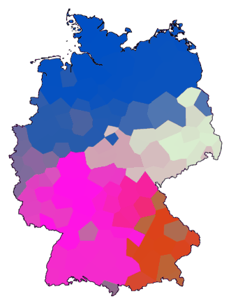
7.4 Clustering and multidimensional scaling
We saw that clustering transforms a table of differences into a new table of
differences. You can apply multidimensional scaling (MDS) to the new
difference table, and make it into a colour map, just like we did with
the original table of differences, but this time, the effect of
clustering shows in the colour map. You can use this method to make
strong visualisations of clusters, without the weaknesses of an ordinary
cluster map, but still with some of the weaknesses of MDS. The colour
space is limited, so you can only visualise a limited number of clusters.
Small and large tables of differences
have been used in tests under different circumstances to determine a
set of parameters that seem to work quite well in most cases:
- using cophenetic distances
- a combination of clustering with weighted average and group average
- noise: a noise level of 0.5 seems sufficient,
with 50 repeats
- MDS using the classical method
- equal weighting of all colour components in
drawing maps (maprgb with the -e option)
The last item has effect only for small areas, with less then four "superclusters".
This method generates maps with clusters in four main colours, with smaller
clusters indicated as variations of the main colours.
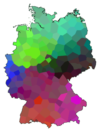
Here is an example using the parameters listed above:
    cluster -wa -c -N .5 -r 50 de.dif > tmp1
    cluster -ga -c -N .5 -r 50 de.dif > tmp2
    difsum -a tmp1 tmp2 > tmp
    mds 3 tmp > tmp.vec
    maprgb -e de.cfg tmp.vec > de10.ps
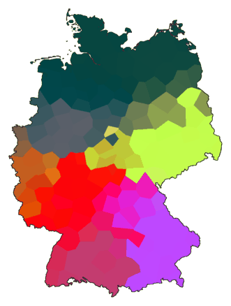
Below are a number of examples using other sets of parameters:
    cluster -wm -b -m 8 de.dif > tmp1
    difsum de.dif 4 tmp1 > tmp
    mds -K 3 tmp > tmp.vec
    maprgb de.cfg tmp.vec > de11.ps
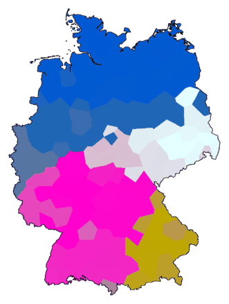
    cluster -wm -b -m 8 -N 2 -r 100 de.dif > tmp
    mds 3 tmp > tmp.vec
    maprgb de.cfg tmp.vec > de12.ps
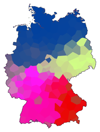
    cluster -wa -c de.dif > tmp
    mds 3 tmp > tmp.vec
    maprgb de.cfg tmp.vec > de13.ps
    cluster -wa -c -N 4 -r 100 de.dif > tmp
    mds 3 tmp > tmp.vec
    maprgb de.cfg tmp.vec > de14.ps
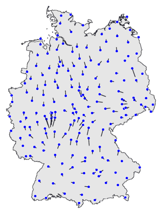
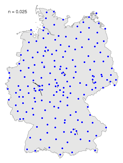
7.5 Vector maps
The use of
mapdiff directly on the unmodified table
of differences is not very useful. But there is a way to visualise the
raw differences directly, using the
vector map.
You create such a map with the
mapvec program.
Immediately below is the command to make a vector map. The result is shown
below the command. To clarify how to interpret such a map, a cluster
map is shown on the right to compare with.
mapvec -n .2 de.cfg de.dif > de15.ps
The blue dots are the locations, the data points. De black lines are the
vectors. A vector points in the direction of the area with the locations
with which the dialect differences are the smallest. You can recognise
dialect borders where vectors on both side of the border point away from
each other.
In the calculation of the vector of one location, only locations in the
neighbourhood are considered. Other locations are ignored. You can
adjust the size of the neighbourhood with the
-n option. If you choose a value close to
zero, then the neighbourhood is very small. If you choose the value one,
the neighbourhood covers to the whole map.
You can see the effect of different values in this
animation. If you choose a small value, the less
important locale effect are visible, the less important dialect
borders.
In the south of the map above, you can recognise the dialect border between the
red and the purple area.
If you choose the maximum value, then the less important
dialect borders disappear, and the most prominent dialect borders show
most clearly.