deze tekst in het Nederlands
How to map difference between geographic areas
Suppose, you have interviewed people all over the country, and have written
down their pronunciation of a large number of words. Now you would like
to know in what places people speak the same dialect. Put differently,
you would want to make an outline of dialect areas in the country. How
can you do this?
Or suppose, all over the continent you have captured specimens of a rare beetle,
you determined the genetic characteristics of each specimen, and now
you would like to create a map that shows the living areas of the beetles
that are closest related.
For now, let's restrict ourselves to the example of dialects.
To begin with, you need to determine for each word how much the pronunciation
differs between two places. This difference can be expressed in a
value. (One technique to do this is the Levenshtein Method. A demo and
a short description can be found elsewhere.)
If you calculate the mean of the differences for all words as they are
pronounced in those two places, you have a value that expresses the
difference between those two places. Repeat this for all pairs of
places, and you end up with a table of differences. You'll have a
distance table for the entire country, but not a table with geographic
distances, but with differences in pronunciation.
From distances to relative positions: multi-dimensional scaling
Once you have a table with differences between hundreds of places, you can not
easily get any global impression from that table. How can you represent
those values in a clear visual manner? As an example we start with only
four places, labelled A through D, whose differences are listed in the
following table:
| A
| B
| C
| D
|
| A | 0.0
|
| B | 1.4 | 0.0
|
| C | 3.0 | 4.0 | 0.0
|
| D | 3.0 | 4.0 | 1.4 | 0.0
|
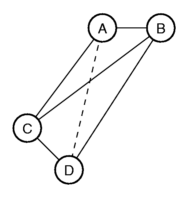
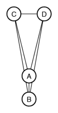
Let's try to represent these differences graphically. We put A and B next to
each-other, at a distance of 1.4. Next we put C such that the distance
to place A is 3.0, and the distance to place B is 4.0. You get a
triangle. When we now try to add D to the picture, we run into
problems. We can put D such that the distance to C equals 1.4, and
the distance to B equals 4.0, but then the distance to A is not 3.0,
but 3.5.
The only possibility to get all the distances exactly right, is to put
the four places in three-dimensional space.
But if we want to put the four places on the two-dimensional plane, then we
need to tweak the distances. We make some distances a bit shorter, some
a bit longer, in a manner that hurts the overall picture as
little as possible. We get a new table with differences:
| A
| B
| C
| D
|
| A | 0.00
|
| B | 1.10 | 0.00
|
| C | 3.03 | 4.10 | 0.00
|
| D | 3.03 | 4.10 | 1.44 | 0.00
|
With these differences, we can map the places like this:
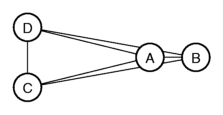
In the figure you can see that the places are part of two groups, one group
with A and B, the other group with C and D. The distances within each
group are small compared to the distances between the groups.
The technique to map elements from a table of differences onto an area with a
limited number of dimensions is called multi-dimensional
scaling, MDS for short. There are several algorithms to perform
MDS, and these algorithms are often implemented in
statistics software. The algorithms themselves will not be discussed here.
From multi-dimensional scaling to colour maps
Multi-dimensional scaling, MDS, can be applied to tables with differences
between hundreds of places, but if we want to map the result on the plain,
including place names, it becomes very muddled, with some places so close
together that the names overlap each other. Another potential problem with
MDS in only two dimensions is that it might be inadequate to show clearly the
variation between all areas, because there is no linear relationship
between geographic distance and dialect difference.
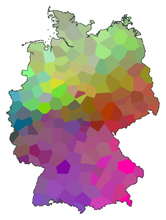
What we really want is a geographic map that shows each dialect area with its
own colour. We can use MDS to accomplish this, in quite a simple manner.
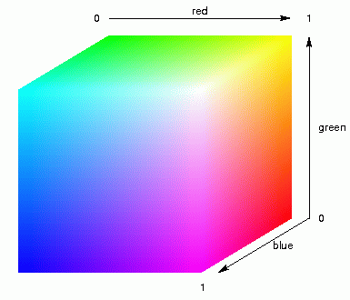
We start with MDS into three dimensions. We do not map the places onto the plain,
somewhere in a square, but into three-dimensional space, somewhere within a
cube. The distances within this cube will represent the relative dialect
differences between places. Next, we fill up the cube with colour, as is
demonstrated in the animation above left. Then, each place will be assigned the
colour within the cube where the place is located, and that colour is
used to mark that place on the geographic map. The result is shown in the
map below.
Let me explain it differently:
By applying MDS in three dimensions you assign each place three coordinates, an
x-, y-, and z-coordinate, a positions somewhere in width, height and
depth. These three coordinates are used as values between light and
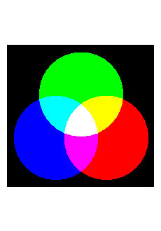
dark of three colour components: red, green, and blue. Mixing these
primary colours results in a specific colour. The animation above right
shows this mixing of colours for light and dark components of red,
green, and blue.
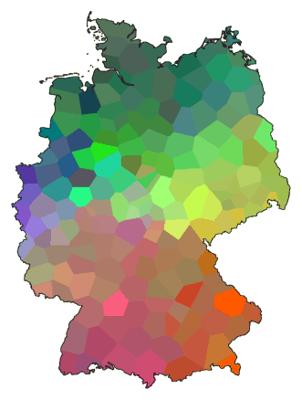
This map of Germany shows the north as a predominantly green area, and there's
an area in the south where shades of red dominate. This shows that the
dialect spoken in the north is quite different from that spoken in the
south. You can see also that along the cost (the north), from the border
with The Netherlands (west) to the border with Poland (east), the dialect
does not change very much.
Joining places into groups: clustering
Here is the same table as was used earlier, with distances between places A, B, C, and D:
| A
| B
| C
| D
|
| A | 0.0
|
| B | 1.4 | 0.0
|
| C | 3.0 | 4.0 | 0.0
|
| D | 3.0 | 4.0 | 1.4 | 0.0
|
Let's join the two places that have the smallest distance between them. The
smallest distance is 1.4, which happens to occur twice. Let's just
choose one pair: A en B. These we join, and create a new table of
distances:
| A+B
| C
| D
|
| A+B | 0.0
|
| C | 3.5 | 0.0
|
| D | 3.5 | 1.4 | 0.0
|
The places A and B are now replaced by a single element, labelled A+B. The distance
between A+B and C is set to the mean of the distance between A and C
and the distance between B and C. We do the same for A+B and D.
(Using the mean value of the old distances as the new distance is just
one of several methods.)
Again, we locate the smallest distance in the (new) table, which is the
distance between C and D. We join these, just like we did with A and B
before:
Now we have only two elements left, one cluster of the places A and B, and one
cluster of places C and D. This stepwise joining of places in ever
larger clusters until you have only a few clusters left, is called
clustering, quite obviously. This stepwise clustering such as
we did above can be displayed graphically:
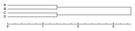
A graph such as this is called a
dendrogram. The vertical lines joining
clusters represent the distance between the clusters at the moment
they were joined. In this dendrogram, you can see that A belongs to B,
and C belong to D.
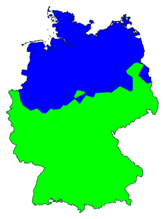
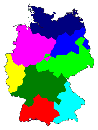
Now we do the same with a table for 186 places in Germany. The resulting
dendrogram is given below:
We did something special with this dendrogram. We put in a vertical line (grey)
and gave each cluster formed immediately left of that line a separate
colour. What you get is a devision, a clustering, into eight groups. How
these groups are joined into fewer, larger clusters is marked by the
black lines.
Names of places are left out, so we could put the lines closer together. We
don't need the names, just the colours. We can use those colours to
draw a map of clusters:
For comparison, here are the MDS map and the cluster map side by side:
Note how these maps in some areas don't agree with each other.
Disadvantages of MDS colour maps
The obvious disadvantage of a colour map is that it can't be used in black and
white publications. Most scientific publications are in black and white.
Colour is too expensive.
But the colour map has some shortcomings of itself too...
Above left is the same MDS colour map as before. Next to it a cluster map
with only two clusters, showing only the most import cluster
border. To get such a cluster map, you continue clustering until you have
only two clusters left.
Apparently, the north/south border is the most important dialect border in
Germany. But does it show as the most prominent border in the MDS map,
on the left? Me, I can see several borders in the map on the left, but not a
trace of that important north/south border. Perhaps, it is because I am colour blind.
Red/green colour blindness is a hereditary affliction quite common among men.
With this colour blindness, I can see the difference between red and
green, but if I look at the three colours red, green, and blue next to
each other, it is blue that stands out. A weak change in shades of blue
captures my eye long before a much stronger contrast between red and green.
This means that, in this colour map, I see a different division in
dialects than someone without colour blindness.
Have another look at the colour cube above. What would happen if you rotate
the contents of the cube around its centre? All distances between places would remain
the same, but each place would be in a different colour. Or look at
these pictures below:
The figure is rotated, the distances among the places have remained the same.
With MDS, all point are located such that their relative distances match as
well as possible with their differences, but how the set as a whole is
located is arbitrary. It would not make any difference if the x- and
y-axes were swapped, or if one axis were mirrored. The complete
figure could be rotated over any arbitrary angle.
This means that, with an MDS colour map, you could swap colour components as
you please. Formally, the map would be the same, but the visual effect
can be quite drastic:
Now we put the new colour map next to the map with two clusters:
The cluster border that was invisible to me in the first colour map is
the most prominent border by far in the new map!
And that is not the end of the story. On a computer screen, the colour components red, green, and
blue contribute very differently to the brightness of the image. The
difference in brightness between black and blue is much less than that
between black and green.
To conclude: the arbitrary assignment of colour components has a huge effect
on the visual result, and thus to the perception of map regions.
Question: how is this for people who are not colour blind?
When you print the map on paper, it turns out that the contrasts have changed
from how they appear on screen. The green component is on paper much
darker (compared to other colour components) than on a computer screen.
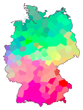
Some of these problems can be overcome by using what is known as a
CIE standard, which is based on how the
human eye perceives colour components. (But this is no solution for
colour blindness.) Below, left is the original colour map, and to its
right the same map using colour mapping according to CIE. (The program
I used to create this image may not represent the full CIE standard, so
I'm not sure these colours look the way they should.
NEED TO CHANGE THIS TEXT)
A final remark: as you can see, the colour cube has only eight corners. For
maximum contrast, there are only eight colours available. If there are
more colours needed, they need to be put in between. This means, there
could be as much as thirty very distinct dialect areas, an MDS colour map
would never be able to show all these areas separately.
Disadvantages of cluster maps
The map above leaves some important questions unanswered:
- What is the most important cluster border? What is the global devision into
clusters with large differences, and what is the more detailed
devision into clusters with smaller differences?
- Could there be more clusters than is shown in this map?
- How sharp are borders between clusters really? Are they firmly fixed, or
could they shift easily with small changes in recorded data? In other
words: what are the strong borders, and what borders are more
arbitrarily drawn somewhere in an area of gradual change?
The map with eight clusters does not tell you which is the most important
cluster border. If you want to know this, you need to look at the map
with only two clusters. If you want to know the stepwise devision in
ever smaller clusters, from important devision to ever less important
ones, then you have two choices. Either you use a whole series of maps,
starting with a map with two clusters, and each next map one more
cluster. Or you put a coloured dendrogram next to the map so you can
work out from looking at the dendrogram how the clusters shown on the
map are
joined into larger clusters.
Here is again the dendrogram for dialects in Germany:
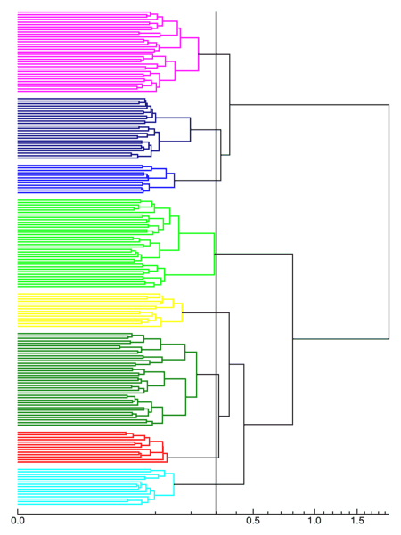
If you shift the grey vertical line a tiny bit to the left, the bright green
cluster is spilt into two, and you have nine clusters. Shift the grey line
a bit to the right, and you have only seven or six clusters left.
So, how many clusters are there really?
The eight clusters all show neat and coherent areas. But does this mean that
the borders you see are true dialects borders? Not necessarily.
Above you see two rows of rods. To top row can be easily divided into two. On the
left are large rods, on the right small ones. Drawing a border line right
through the middle puts the long rods in one cluster, and the small rods
in another.
Now for the bottom row. This row too can be split in two by drawing a border
line straight through the middle, and the rods in the group on the left will
all be smaller than the rods in the group on the right. A neat
division. However, this border line is arbitrary. You might as
well divide the bottom row in three groups with an equal number of
rods, and what you first had as a border for a devision in two groups has
now become the middle of a group.
With a cluster map, however well organised it looks, you cannot see which
border line represents a true border, and which border is placed
arbitrarily across an area of gradual change.
A new kind of map: composition of multiple clusterings
I propose a new kind of map: the
composite cluster map.
Maps of cluster compositions have non of the disadvantages discussed for MDS
maps and ordinary cluster maps. And a cluster composition
offers a few things extra. With a composite cluster map you can show
the true geographic variation more clearly than with the other maps.
A composite cluster map is a map that combines the results of several
clusterings. Instead of giving each cluster its own colour, you draw
the lines between clusters. You run several clusterings, add the result
of each clustering to the existing map, and each time a line is drawn
again on the same position as with a previous clustering, it is made a
little darker. You get a map with light and dark lines.
You can use this method to show the steps of a single clustering in a single
map. You cluster into two groups, and draw the resulting border. Then you
cluster into three groups, the first line is drawn a second time (it
becomes darker) and a new line is added (lighter than the other line).
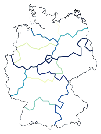
The map below shows the result of a stepwise clustering into twelve groups.
The map above still doesn't show you which cluster borders are true dialect
borders. We can change this by adding noise to the clustering process.
Clustering is done on a table of differences: measurements. How reliable are
these measurements? And by extension: how reliable is a clustering
based on these measurements? You can test this by varying the values in
the table, and see if this effects the clustering. You add some noise,
and if the border between two areas is solid, than some noise won't
effect the position of that border. Borders that are less clear will
tend to shift as a result of noise.
The cluster composition below is the result of repeated clustering,
with random noise added before each clustering.
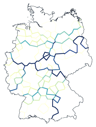
Some borders are very clear. The most important cluster border, the division
between north and south, stands out the most, even though the exact
position is not absolute clear near the Dutch border (east).
You can see that there is a sharp border in the south, but how the areas on
both sides
differ a little further up north is unclear.
The dialect east of Overijssel and Gelderland (the west, directly north of the
north/south divide) differs from that near Denmark (middle, top),
but the transition is gradual, so it is not possible to draw the border
accurately.
All maps on this page are made from the same table of differences, and based on
the same clustering algorithm. You can also use cluster composition to
combine results of different measurements and/or clustering algorithms.
Next...
Examples
Several maps are repeated below. An MDS map or ordinary cluster map on the
left, a cluster composition at the right. For comparison, without further
comments.