Assignment 2
The essence of tabling data is of course trying to put as much information possible in the most efficient way. That does not mean that, if you run out of space, by just resizing your fonttype, you are done. When it comes to efficiency in tables, it means you take a very close look at the design of the table. How to arrange your space is the most essential thing to keep in mind. As it is in most of all cases concerning communication, you should first ask yourself what has to be communicated. Then you determine the target group, in order how to communicate your message best.
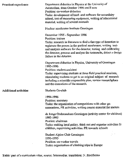
The example to start of with is a CV added to a letter of application. What needs to be communicated is your experience as a student, an employee and other activities. Your target group is your possible future employer. If this person is lucky, a lot of candidates wrote a letter of application, which means there is little time to read all letters and CV's in detail. Your CV needs to communicate clearly, that you have the appropriate work experience and diplomas, together with a right deal of other activities (showing you do have a social life and additional interests on top of what is asked).
A sum up of practical experiences and additional activities simply is not enough. As you can see for yourself, the example given here, is a very good example of how you should not arrange a CV. Apart from that it does give the impression this candidate is experienced and active, it is not clear where both of these qualities took place. Nor is clear how recent the experience is, although the order (from most recent to earliest) is right. But that you can read only by taking a second look at it.
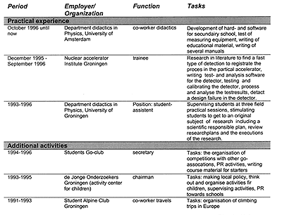
Having said all this, in the improved version all of these should have been taken into account. One of the most notable aspects of this table is the clear optical distinction made between practical experience and additional activities. By using four columns, repetition from terms has been avoided. The most radical change is made in the texts in the 'Tasks' column and an editorial change.
Now, by having made these changes, a reader quickly gets an overview of the experience of the candidate. Meanwhile the timelines are clear and it is easier to judge whether this candidate has the appropriate capabilities, or not.
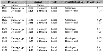
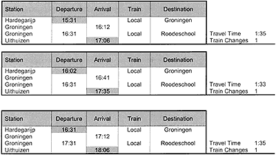
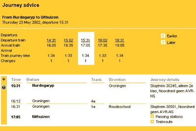
Timetables can be found in al kinds of shapes. Not all of them are equally clear, although they are suppose to give the same information. In the following case students were asked to design a time table for a trip from Hardegarijp to Uithuizen (The Netherlands). The intended time of departure of 15.30h and alternative times were given. Beneath you find two results from this assignment. Compare them both for yourself and find out which one is easier to read. How does the typography effect the readability? How many reading directions are used within one table? Are they logically used or not? Which provides the time information best? What information could be left out? Or might there be information missing?
Overall both tables provide the same information. Exceptions are the travel time information and the information about the number of changing trains. Like in the previous CV-case grey boxes are used to lighten up the rows of column information. In the second version the same grey background is used to emphasise the time of departure and arrival. The upper one does this by using a bold fonttype for arrival-/depature time and their corresponding stations simultaneously.
Another distinction to be made is the fonttype itself. Using a serif or a sans serif makes a big difference. It effects the speed of reading. Reading from left to right takes quite a deal of time using a sans-serif fonttype where a serif type excels in readability. This is due to the small horizontal lines, which can easily be drawn from one letter's foot to the other, e.g. between an 'i' and an 'm' in the word 'aim'. By changing the type into a sans serif, aim is more fragmented as a lose a, i and m. Nether the less the second version of the timetable is completely in a sans-serif fonttype and readable, but is it a bad one? - No. Because sans-serif fonttypes do not let themselves connect by horizontal footlines easily, words which are printed in sans serif are very easy to read in a vertical direction. Try out for yourself and experience the difference between reading both tables in vertical direction. Note your eye 'jumping' from Hardergarijp to Groningen over and over again reading the upper one, while reading the lower table you read Hardegarijp, Groningen, Groningen, Uithuizen at (almost) one glance.
The official webversion provided by the Dutch railways shows a split in the information. The upper half of the table is a summarisation of the total time schedule. More details of a trip in particular are shown underneath. Both tables are mainly vertical orientated, going down from departure to arrival. A plus-point for clarity. But is it really necessary to have a split here? For this example the answer maybe 'no', but for trips where more than one route is possible, or where changing trains takes place at different stations it might be.
For those wondering whether 'Hardegarijp' is misspelled, the answer is 'No', but the Dutch railways used the local name. The journey details in the last column are in Dutch, due to the fact the English and Dutch versions use the same database.
The first assignment is to put the television program list from BBC One, Two and 4 and Channel 4 in two kinds of tables. To start from a blank document is recommanded, instead of reorganizing this very bad table.
1.a Arrange the program lists in a table in the most common way; in order of time. Please keep the following in mind while working on the table:
1.b Now put the lists in a table sorted by type of program. You do not need to use the content information again. Arrange them under the following heads: informative and documentary, gameshows & entertainment, news & opinion, drama series, film and kids.
Note that not from all programs in the list the information of content is given. From most of them name and time give a clue though.
Practical Assignment 2.2
This phonetics table shows us which consonant possesses an array of specific properties in the Dutch language. To find a consonants properties quickly is hard to do from this table due to the way 'true or false' is notified
2. Develop an alternative for this table and give arguments for the changes you made.
Be aware that by changing the fonttypes in the table, you might loose some of the symbols.
(Click to enlarge)
(Click to enlarge)
(Click to enlarge)
(Click to enlarge)
(Click to enlarge)
Practical Assignment 2.1
- The programs of both stations should be clearly separated visually;
- The reader should get some sort of overview of how the program is scheduled over the whole day;
and
- Time, the name of the program and, in some occasions, the extra info given should all be displayed.
Remember:
- to use the timeline under each head;
- to show the station number;
and
- to put the heads in a logical order.