Assignment 3
Relations between the data
Converted table data into graphs gives the reader a quick view on relations between different groups of values. One has to be very cautious though which relation is being communicated.
The table underneath shows the annual growth of advertising expenses made within the Europian Union and within the Netherlands
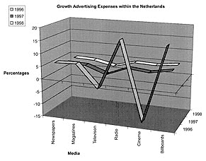
If you would let Excel, in Windows 98 version, draw a linegraph from each of the two areas, at first glance it seems to be a rather fancy 3D-graph.
It doesn't take long though, before you see something is wrong with it. But what does it tell you exactly? Are the lines drawn between the six different media informative? What do they represent? And are the values on the Y-axis easy to determine?
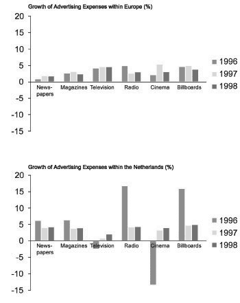
A more common barchart, in which the media are separated, does the job more properly. Mind that the Y-scales match each other to compare the graphs more easy. Consider the effects of basing the graph on percentages. Can you see from these graphs what the cumulative effect of the three years was? Try to determine wether television or cinema showed more growth in the period 1996-1998.
To compare the growth over the years from each medium, is one thing. To compare growths of the different media is another. But how the amount of expenses relate from one medium to the other, can not be seen in this graph. For this you need exact numbers. It is quite likely a reader concludes, that in the year 1996 advertising expenses for both radio and billboards in the Netherlands were much higher than within the other media. This is of course a wrong conclusion, since we can not read the exact numbers out of this graph. If we were to draw a conclusion from this graph, it would be that amoung these different media, in the Netherlands the advertising expenses within newspapers and magazines were the most stable ones. And if we would compare both graphs, the advertising expenses for radio, cinema and billboards are more liable to fluctuations in the Netherlands than within the whole of the EU.
Two different entities
The second example consists of two kinds of values; growth of numbers of cars and the number of traffic casualties. We go through the conversion from table to graph step by step. The intention behind the graph is the question 'Is there a possible connection between the growth in the number of cars and the number of casualties?'.
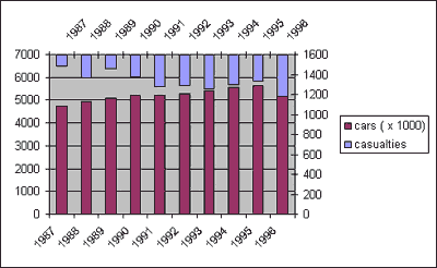
This is the simplest graph Excel produces when a second Y-axis is added. Note the difficulty in reading the number of casualties. It is easy to interpret the bars in the wrong way. And which Y-axis value belongs to which subject? Is there an overlap of bars in the year 1996, and if so; which one is in front then?
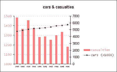
Here you see a more reasonable result. The data is re-designed and values and related subjects are given the same color. Due to the program used, the values of the car increase had to be changed to a line, in order to keep a "bottom - up" direction in reading both sorts of values. Maybe this is not ideal, but far more better than the first attempt. Which faulse conclusion could accidently be drawn from the point line crosses the bars?
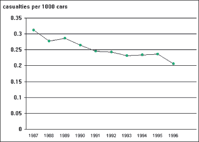
With the answer to the question kept in mind, you could choose to re-calculate the data and visualize the outcome of that. There is a big difference though in the information you supply to the reader. In this case the figures of car increase over the years are hold back from the reader. Therefor it is likely the 'man of the street' would prefer the earlier version above this one. Amoung a specific group, e.g. carsalesmen, this re-calculated version could give the answer to the question best. For the mentioned group of carsalesmen, this could give them a reason to believe cars have become saver.
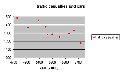
Following the theory on representing two different entities, we should consider a scatterchart. Which information will be shown in such a chart and which will be lost? What effect does this loss have on reading the chart? Look at the chart beneath and try to find the answers to these questions.
The timeline can not be left out of a graph unconditionaly. In this case it is likely to assume the number of cars increases over the years. This means the points in the scatterchart are kept in the same order as in a chart with a timeline. Compare the graph to the previous one. Which simulairity do you see?
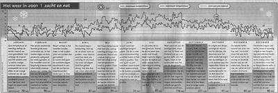
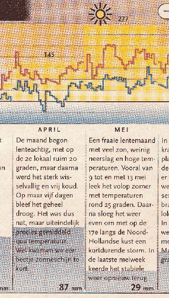
As an example we take a look at the graph below 'Het weer in 2001 | zacht en nat' (= The weather in 2001 | soft and wet). It shows the weather conditions over the year 2001 in the Netherlands. The first question you should ask yourself is "what kind of data is shown here?". In this first assigment the emphasis lays in the amount of data to use in a chart.
1.a Make a short analyses of what you see. Does the graph confirm the expectations you got from the title?
1.b Point out exactly the shortcomings and the quality points of the graph. You may be very critical. Take the points of focus in chapter 'Numerical Graphics' from the oral lectures as a lead.
1.c After you made your analyses it is time now to improve the graph. There for you need the source data which you can find under this link. Remember your points of critique and incorporate them into your graphical representation of the Excel data.
Practical assignment 3.2
Social health always seems to be a hot issue. The money is a struggle and over the years hospitals had to work more efficiently because of a shortage of personal. In the following assignment we ask ourselves whether sending patients home earlier have reduced the costs of Dutch hospitals.
2.a This link provides you a table in which you will find the information you need. Be aware that you will only need a part of the information given. Choose only those columns you think are appropiate. Think of the rest as background information, in order to give you an idea of the overall situation. Before you start working on graph itself, make a short list of points of attention.
2.b Analyse your result judging from your own list of attention points.
If you want more information about Excel, please click here.

(Click to enlarge)
(Click to enlarge)
(Click to enlarge)
(Click to enlarge) - Source data provided by Centraal Bureau voor de Statistiek, Voorburg/Heerlen, the Netherlands.
(Click to enlarge)
(Click to enlarge)
(Click to enlarge)
Practical assignment 3.1
(Click to enlarge) - (Algemeen Dagblad, 29 December 2001)
(Click to enlarge)